
|
Sync Tab |

Cockpit |
Variables & Prompts Tab |

|
 Cockpit - Cockpit Tab
The Cockpit tab is object-type specific and is only available in "Cockpit" objects. In this tab, you can set the cockpit's display elements and its properties.
Object class: Cockpit
Object class: Executable object
Object type
(short name): CPIT
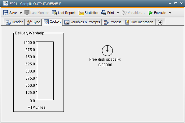
You can stores the size and the order of the display elements in the Cockpit tab and the size of the object itself. In doing so, you can set up the display in your preferred way.
In the "Cockpit" tab, you can use the display elements Box, Bar, Pie, Traffic Light and Lamp. Use the popup-menu command "Display Element" to create a display element.
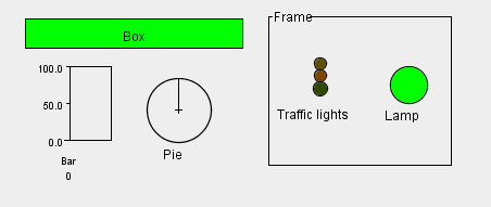
All display elements can be arranged as required and their size can be adjusted. By using the mouse, you change the position or size by 10 pixel. You can be more precise by using the keyboard. The arrow keys can be used to change the size by pressing the SHIFT key and the position by pressing the CTRL key (by 1 pixel). Display elements can be grouped into frames. Press the CTRL key and click on an element. This element is now shown with a red frame. Drag it into the frame. Vice versa, you can also remove a display element from a frame.
Displayed elements cover each other if they overlap. The highlighted element is always in the foreground. Keep this in mind when you move or change frames within a cockpit.
Display elements and frames can be copied and pasted. You can do so with all objects between different cockpits. Use the key combination CTRL+C and CTRL+V or the relevant popup-menu command. You can also delete display elements and frames that are no longer required.
In the properties of a display element, you can define its precise function, display and data source. Select the popup-menu command Properties in the highlighted display element.
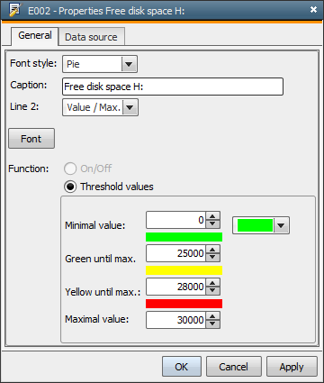
You can change the way that elements are displayed at any time. Simply select a different display element from the dropdown list. In the text field Caption , replace the default value by your specific term which serves as the label in the cockpit. This field is limited to 30 characters. Select from the dropdown list what should be displayed in the second line. This can be the monitored value (as a number or in percent), the value and maximum value (numbers next to each other), an empty line or a text. Font settings can be specified using "Font..." command.
Display elements work in different ways:
Threshold values (primarily for traffic
light, pie and bar)
In order to display three colors, you must select the option Threshold values . Specify the minimum and maximum value as well as the
threshold values for the yellow indicator. At runtime, the values are displayed in the colors that are defined here.
On/Off (primarily for box and lamp)
To use box or lamp for on/off display, you must select the option On/Off . At runtime, the values are displayed in the colors that are defined here. If the value equals zero, the display is "Off" (red).
If it does not equal zero, the display is "On" (green).
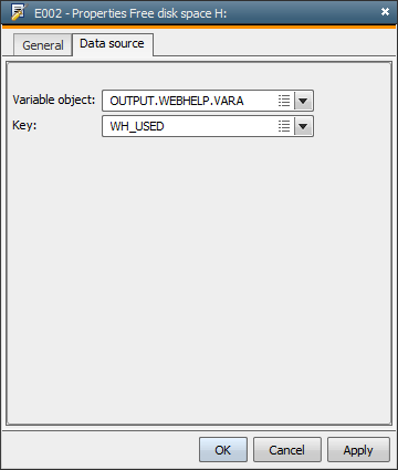
In the Data source tab of the properties, you can define the Variable object that is used to retrieve the monitored value or status. You can specify static or dynamic variables.
Use the dropdown list "Key" in order to determine the particular entry that should be used to retrieve the value. If you do not specify an entry, the system automatically uses the first line.
In static variables, the value is always read from the "Value 1" column, and in dynamic variables always from the first basic column (the first column that is shown after the result column).