The Processing Load Data Insight
The Processing Load data insight is a tool to monitor and analyze trends in the processing load on your schedulers and their agents (machines) by showing you load information in both a graphical and a tabular form, as well as giving you totals of execution delays by time interval.
This topic describes the Processing Load data insight, what it shows, and how to work with it to explore and investigate processing loads across your system.
For general information about how to work with data insights, see Using a Data Insight. For information about creating and maintaining data insights, see Adding, Editing, Copying, and Deleting Data Insights.
This page includes the following:
Purpose
The Processing Load data insight type gives you a clear picture of scheduler performance by showing you the following:
-
The total number of jobs that are running within an interval of time
-
The total time in execution delays for each scheduler or machine during each slice of time
The graph, which you can zoom into and out of, reveals spikes and valleys of processing load to help you discover where you might optimize your scheduler and machine loads.
Furthermore, because you can create a processing load data insight for totals by machine, it becomes a tool to support charge-back models to application teams.
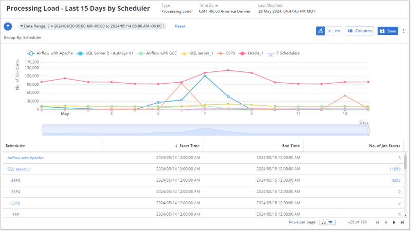
Sample
The following is an example of a Processing Load data insight that shows the scheduler load over the last 15 days. Each line represents one scheduler and it plots the number of job starts on the vertical, y-axis at various time intervals on the horizontal x-axis. The differences in the processing load among the schedulers become apparent when you see them visualized like this. The peaks and valleys of the loads also points to possible opportunities for improving your resource distribution.
The table below the graph shows the details per scheduler at each time interval. The data on the table and graphic are synchronized, so that when you change filters or zoom in or out on the graph, the two cover the same data.
Understanding and Using the Processing Load Data Insight
A Processing Load data insight includes a line graph that shows the total number of job starts (the vertical y-axis) during a specific time interval (the horizontal x-axis). Each line on the graph shows the total job starts over time for a scheduler or a machine, depending on the Group By setting. The spikes and valleys show when processing load is particularly high or low. Use that insight to determine where you can redistribute your processing load.
What You See on the Processing Load Data Insight
The following are parts of the Processing Load data insight that are characteristic to it:
-
The Group By option is not editable. It can be set to Scheduler or Machine. You can set this option only on the Filters tab of the data insight definition, which requires that you are the owner or an editor.
-
The graph shows you the number of job starts on the vertical y-axis and time intervals on the horizontal x-axis. The time intervals are the next logically smaller interval of the time period in the main filter. For example, if the filter is for the last 15 days, the x-axis intervals are days; whereas, if the filter is for the last 24-hours, the x-axis intervals are hours.
-
Each line is a scheduler or machine and each data point is the number of jobs started in the corresponding interval for a specific scheduler.
-
The legend above the graph shows which line color and data point symbol on the graph corresponds to each scheduler or machine (depending on the Group By setting). The six schedulers or machines with the highest number of job starts have their own line, and all the remaining schedulers or machines are summarized in n Schedulers or n Machines. The n number is the total minus the six that are showing.
Tip:If you want to see specific schedulers or machines that are not in the top six and therefore in the summary amounts, use filters to select them.
In general, use filters to manage the large number of Machines when viewing a data insight grouped by Machine.
-
The data table shows the corresponding data on a table.
What You Can Do on the Processing Load Data Insight
Both the graph and the data table on the Processing Load data insight have interactive features that help you focus on the schedulers or machines and time intervals whose processing load you want to investigate, as well as link you to relevant details. At all times the graph and the data table remain synchronized as you shift your focus. For example, when you change the filter settings, the data in both the graph and table are aligned accordingly.
Interactive features on the graphic
The following are the interactive features on the graph:
-
On the legend, each scheduler name is a toggle. Click the name to remove its data from the graph and table. Click a grayed out scheduler name to include its data in the graph and table again.
-
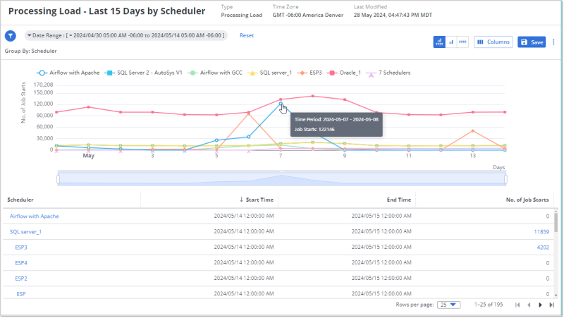
Mouseover a data point to see a pop-up with details of the time interval and number of jobs started in that scheduler or machine in that time.
-
Use the zoom slider under the graph to focus on a on smaller or greater time range within the filtered time period.
-
You can move from either the left or right to define the span of time that you want to focus on.
-
Alternatively, mouseover anywhere onto the graph, stop and roll your mouse wheel up or down to zoom in or out on the time period, equally from left and right. The upper limit is the time period setting on the mail filter.
-
The interval scale on the horizontal x-axis (daily, hourly, and so on) does not change.
-
The table is filtered to the time span that the slider shows. (Hint: You see the number of rows for the table change accordingly.) Whereas the main filter for the data insight remains unchanged.
-
-
Click a data point to drill down to smaller time intervals.
-
The first click takes you from days to hours, zooming in to the hour of the data point you clicked. The second click takes you from hours to 5-minute intervals of the hour of the data point that you clicked. Notice that the main filter for the data insight changes accordingly. Click Reset next to the main filters to return to days.
-
Notice that, as you move in, the schedulers that are shown in the legend might change because the data insight always shows the schedulers with the six highest job starts and summarizes the rest as the total for n Schedulers or n Machines.
-
The time period filter for the data insight adjusts accordingly, as does the table data.
-
Interactive features on the data table
The following are the interactive features that you can use on the data table:
-
Click the Scheduler name to open a window with its scheduler connection definition. This includes both the Monitoring Details and the Connection Configuration. From that window you can edit or even delete the scheduler definition, if you have rights to do that. After closing the scheduler definition, use the back button on your browser to return to the data insight. For more information, see Schedulers.
-
Click the number in the No. of Job Starts column to open the Job Starts Details windows that contains a list of all the jobs that were included in the total.
-
When the window opens the table is already filtered for the time period that you were viewing on the Processing Load data insight when you opened the window, and for the scheduler that the jobs started on.
-
You cannot change the Time Period filter, but you can filter on Job Name, Machine, and Scheduler.
-
-
The columns that the table can include are Job Name, Start Time, End Time, Machine (this in included regardless of the Group By option set for the data insight), Scheduler.
You can filter the list and configure the columns like any other table. For information, see Using Filters and Working with Tables.