The Trending Jobs Data Insight
The Trending Jobs data insight is a tool to support optimizing job and jobstream performance by showing trends in increasing or decreasing run times by job. When you see trends towards increased run times, you know where to focus optimization efforts. After making changes, run this data insight to find out whether the trend has turned towards lower run times.
This topic describes the Trending Jobs data insight, what it shows, and how to use its interactive features to explore and investigate job execution trends.
For general information about how to work with data insights, see Using a Data Insight. For information about creating and maintaining data insights, see Adding, Editing, Copying, and Deleting Data Insights.
This page includes the following:
Purpose
The Trending Jobs data insight type shows you which jobs are showing a consistent increase or decrease in run time over a month or quarter. AAI can scan through the multitude of run statistics in its database and identify inconsistent run times that veer from their average by a margin that you define. This information gives you important indicators of where there are problems in your workload executions. Especially, if a job is in several critical jobstreams, an increase in its run times can move all its jobstreams steadily closer to SLA breaches. Once you have identified jobs with increasing run times, you can investigate to see whether the problem is associated with load balancing, with the job definition itself, or another aspect of the run, and then correct the problem.
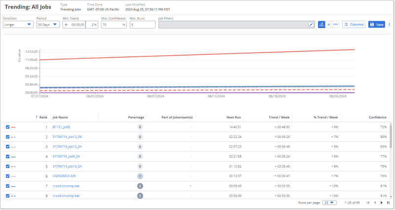
Sample of a Trending Jobs Data Insight
The following is an example of a Trending Jobs data insight that shows which jobs have been trending to longer run times over the last 30 days. On the graph, you see a line of execution times over the 30 days for each of the jobs with the top 10 greatest increase in execution. The ones with the steepest rise in execution times are the first candidates you would want to look into find out the possible causes of the continuing execution time increase.
The table below the graph lists all jobs that fell into the trend filter range in descending order of trend value per week. The top ten also show the line style for the corresponding line on the chart.
The toolbar above the graph shows the applied trend filter settings as well as the job filters. You can modify any of these filter values and both the chart and table will be updated to show the corresponding trends.
Understanding and Using the Trending Jobs Data Insight
A Trending Jobs data insight includes the following three areas from top to bottom in the default view that shows both the graphic and the data table on one page:
-
A toolbar that shows the trending filters and the job filters that are applied
-
A line graph that shows, by default, the top ten jobs with significant trending variances
-
A data table that lists all jobs that met the trend and job filter criteria.
As with other data insights, the graphic and the table are synchronized, always presenting the same data although one is visual and the other tabular.
The Toolbar of the Trending Jobs Data Insight
The toolbar of the Trending Jobs data insight contains the values defined for the Trend Filters and the Job Filters.
You can change these values while viewing the data insight, and the data will be recalculated and presented accordingly. If you do not save the data insight after making changes to the filters on the toolbar, the next time you open the data insight, the filter values will be reset to the ones in the original definition.
The Graphic on the Trending Jobs Data Insight
The Trending Jobs data insight contains a line graph that shows a line for each of the top ten jobs that meet the filter criteria for either the jobs with runs most trending longer or shorter. When examining trends towards longer execution times, the trend lines with the steepest rise would be the first candidates you would want to look into find out the possible causes of the execution time increase. When examining trends towards shorter execution times, the trend lines with the steepest fall would indicate the greatest improvement.
The following are the static and interactive features on the graph that help you understand the trend you are trying to observe:
-
When the trend Direction is set to Longer in the toolbar, the lines will be ascending to the right. When the trend Direction is set to Shorter, the lines will be descending to the right.
-
The vertical y-axis shows the Trend / Week time amounts, that is how much time per week difference longer or shorter (depending on the Direction selected in the trend filter), and the horizontal x-axis shows the dates over the last 30 or 90 days (depending on Period selected in the trend filter).
-
Each line of the ten top jobs that meet the filter criteria is a different color and style (solid, dashed, dotted, and so on). These match the first ten rows of the data table below, where the first column shows you the legend of the line color and style for the corresponding jobs.
-
Mouse over any line at any point in time to see a pop-up with details of the job name and its Trend / Week amount. When you mouse over a line, all other lines are grayed out so you can see the one job's run trend line in isolation. Notice that the corresponding row in the data table is highlighted.
The Table on the Trending Jobs Data Insight
The data table on the Trending Jobs data insight lists the jobs that meet the filter settings that you see in the toolbar. The table has dynamic features including some that work in sync with what you see on the graphic. The following are good to know to best understand and use the table:
-
The data table on the Trending Jobs data insight can show any of the columns that are available to the data insight. When you first open it, you see the columns that are specified in the data insight definition.
-
By default, when you open the data insight, the rows are ranked sorted according to the values for the Trend / Week column, which shows the difference in run times for each job's runs over a week. This means the following:
-
When the trend Direction is set to Longer in the toolbar, the column is sorted in descending order, the greatest to the smallest difference. When the trend Direction is set to Shorter, the column is sorted in ascending order, the smallest to the greatest difference.
-
The Rank column shows the rank of each job based on the Trend / Week values and the trend Direction. Even when you sort by other columns, the Rank number stays the same. This can give you more complex understanding of where the job stands among, for example, the Next Runs.
-
-
The left-most column contains a checkbox for each job. When the box is checked, a legend of a line color and style appears next to it. This corresponds to a line on the graph with the color and style. By default, the top 10 jobs that meet the trend filters are checked and depicted on the graphic. To use the checkbox feature to support your investigation of trends, know the following:
-
You can check and un-check the box to display or remove a trend line for any job. You do not have to include or limit yourself to the top 10.
-
Mouse over any row that has a checked box to highlight the row and on the graphic see the corresponding trend line, while any other lines are grayed out.
-
-
Click any number greater than zero (0) in the Parentage column to see a pop-up showing the hierarchy of the corresponding job's parents.
-
Click the name in the Job Name column to open the Average Runs tab page of the job's details. For information, see Job Details - Average Runs.
As with all tables on data insights, you can sort the rows by one or more column values, you can show or hide columns, and you can re-arrange the column order as you need. For information, see Working with Tables.