VARA to Chart Widget
As a chart designer, the VARA to Chart widget lets you create single, or multi-series charts using VARA objects. The VARA to Chart widget helps you understand your data better, by enabling you to reveal a visual picture of trends across your organization.
Widget Description: Data Source
Data source
- VARA:
Select or search for a VARA object from the combo box - Filter Key:
The filter option lets you select your VARA data content according to your specific data requirements.
The following example displays the results when the Keystarts with is selected, and the key word Life is entered in the text box.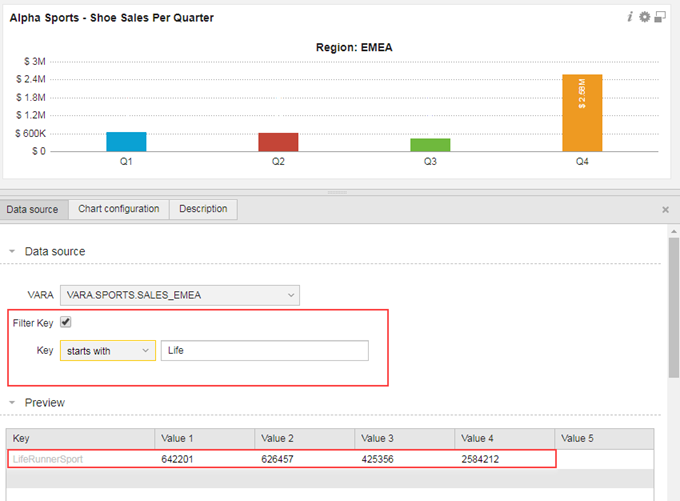
The filter key is useful when you only require a specific set of data contained within the VARA. If the Filter Key checkbox is enabled, you can select the following options:- equals
- contains
- starts with
- ends with
Allow Dynamic Filter
As chart designer the Allow Dynamic Filter option lets you create chart filters that a user can interact with by changing directly in the chart.
To activate the filter check the Allow Dynamic Filter box:
- Select the VARA object column you want to filter from the column drop-down list
- Create a name for the filter
- Click Add
Note: The Dynamic Filter feature uses the same operators as the Filter Key option when activated.
Important! Filters are not saved in a dashboard.
Dynamic Filter configuration Example:
In the following example, the Filter Key is set to starts with Global. This is the primary chart view that the end-user will see when they log into AWI. In this example Global represents the aggregated data of each country sales for a shoe company.
The Allow Dynamic Filter is activated to allow for a chart filter on this data. When the user clicks the chart the Dynamic Filter is displayed, allowing them to select a country from the displayed list.
Dynamic Filter chart view example:
The following chart view shows the use of the Dynamic Filter. By clicking on the chart, the filter panel slides-out to the right. The user can select the Dynamic Filter (Country), select an operator, and one or more country from the displayed list. This particular example displays a global (top level) chart view of show sales per country. When the Dynamic Filter is applied the user can drill-down to a specific country and city view.
For more information, see Creating VARA to Charts Using Dynamic Filters
Widget Description: Chart Configuration
Data and Color Mapping
- Type:
Select a chart type from the drop-down list. The options are as follows:- Area
- Bar
- Column
- Donut
- Line
- Pie chart
- Stacked bar
- Stacked column
Note:
If you select the Donut or Pie type chart, you will only be able to select one VARA data value at a time
- Label:
The Label is set to Key by default, items in the drop-down list corresponds to a Value column in the VARA, which is displayed in the preview. The Key usually represents a label for your displayed data. The Key may be displayed on the X or Y axis depending on the chart type you select. In a Pie or Donut chart, the Key is represented by each slice of the chart.
The following example shows the Key label used in a Pie Chart.
The following example shows the Key label used in a Bar Chart.
- Value:
The Value section lets you select the VARA Value columns to display in your chart. The first value (Value 1) is automatically displayed.
The following example shows each selected value with a defined color and legend label. In this example, each Value (Value 1 to 4) is defined as a financial quarter (Q1 to Q4).


The following table describes each box of the Value section:
| Item | Description |
|---|---|
| Column |
The Column drop-down list lets you select a Key, or Value that is displayed in your chart. Note: Use the Preview table to decided what data to use in your chart. |
| Legend | The Legend text box lets you create a label for your select Key or Value. |
| Color |
The Color drop-down list has five predefined colors to choose from. It is possible to define your own colors by using one of the following:
|
- Appearance
The Appearance section lets you customize the look and feel of your chart. There are many options, and changes that are made in this section are updated live in your chart display.- Title:
Lets you to enter a custom title for your chart, for example, Shoe Sales Per Quarter - Caption:
Lets you to enter a custom sub-title, for example, Region: EMEA - Sub Caption:
Enables you to enter a custom sub-title, for example, 2018 - Show Values:
Values are displayed by default. Clear this check-box to hide displayed values - Format Value as:
Set to None by default. Based on your format value selection, the options change
- Title:
| Format Value | Options Displayed | Description |
|---|---|---|
| Number |
Relevant Decimals |
Set to two (2), but can be changed using the widget. |
|
Thousands Separator |
Set to comma by default |
|
|
Decimal Separator |
By default, set to period (point) |
|
|
Format Number Scale |
This check box automatically rounds-up or down the displayed value format. Example: When the check box is active (checked), the displayed value 8.002.122 is automatically rounded-down to 8m. This option is not for precise measurements. |
|
|
Number Prefix
|
In certain charts, you may need to specify a number prefix for precision purposes. A good example would be to specify a currency sign ($, €, £, and so on) when you are attributing values to a currency. |
|
|
Number Suffix |
In certain charts, you may need to specify a number suffix for precision purposes. A good example would be to specify a unit when you are attributing values to groups of things sold. This is applied to music sales, or shoe sales for example. |
|
| Time |
Milliseconds Seconds Minutes Hours Days |
This value format allows you to apply time precision to a chart values. |
- Legend:
- Enable Legend
This option is not set by default. To activate, check the Enable Legend box - Legend Position
Specify the legend position on a chart use the Bottom or Right option button
- Enable Legend
Widget Description: Description
This tab can be used to provide further information to your target audience.
Note: If you are using a dynamic VARA object and your data is routinely updated, click the dashboard refresh button to display the latest results.