Job End Time Graph Report
The Job End Time Graph report provides an interactive line graph of the exact end time for each execution of selected jobs over a specified time range, based on historical job run data. With this graphic presentation you can clearly see executions with irregular end times, more importantly, you can easily identify the delayed executions.
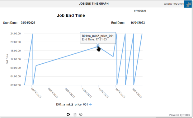
Each point in the graph is an execution. Move your cursor over a point to display run details for individual job runs.
This report is similar to the Job Run History Graph in that it depicts every job execution. Both graphs show you when delays in executions occurred by showing you where the outliers were. One does it by depicting how long executions ran and the other the time when executions ended. For information, see Job Run History Graph Report.
The two graphs are also interactive in the same way to give you individual execution details as well as an overview of the trends.
Click anywhere on the graphic to open the Job Runs History Data Table that lists all the executions that are included in the graphic. That means all the executions that meet the configuration criteria in the configuration for the report, which you can view by selecting Edit from the report menu. For information, see Job Run History Data Table Report.
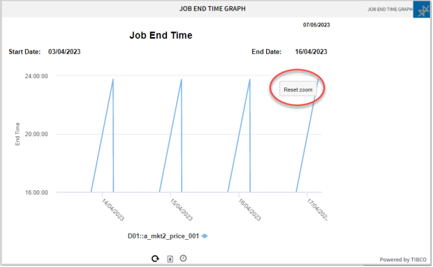
To zoom into a portion of the graph and better see the spikes and valleys of individual runs, click and drag over the area that you want to magnify. To return to the normal view, click the Reset zoom button floating in the upper right of the panel.
Configuring the Report
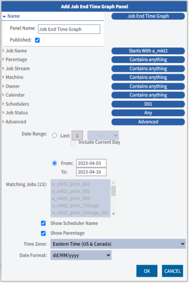
You can configure this report to provide data for one or more jobs. Use the various job detail criteria fields to describe the jobs that you want to include. Click each criteria type to open the selection fields. Within one criteria type the criteria have an AND relationship, and the different criteria types have an OR relationship to each other. If you do not select a time zone, the default time zone of the user where the report is generated is used.
The other configuration options are self-explanatory.
Generally, to get a meaningful set of data, you should specify a data range of at least 30 days.
Working with the Report
Click the icon on the top right corner of the panel to open a menu with the configuration options:
-
Edit
Opens the configuration dialog where you can edit the name, published status, and filter criteria used for the report. For each data source you can add as many criteria as you need to narrow down the scope of the report. Combinations of these criteria are evaluated as logical OR relationships.
-
Copy
Creates a copy of the panel that you can then re-configure and adapt to your needs.
-
Move
Moves the panel to a different page (dashboard).
-
Delete
Deletes the panel.
-
Shorter/Taller
Resizes the panel vertically.
-
Download
Downloads the report in the format you choose: PDF, XLSX, XLS, RTF, CSV, ODT, ODS, DOCX, or PPTX.
-
Get Link
Creates a link to the report that you can share with other users.
At the bottom of the report panel, you find a small toolbar with several icons that you can click for additional options for viewing and scheduling the report:
![]()
-
Refresh: Click the refresh icon to pull the latest data into your report.
-
Download: Click the download icon and select the format in which you want the report immediately downloaded onto your computer.
-
Schedule: Click the clock icon if you wan tot schedule the report to run automatically at specific times. In the Schedule Report to Run options, you can specify the date and times for the runs and repeat options. In addition, specify where the report should be sent and in what format in the Distribution options.
In the following example, you see the Schedule [Report Name] dialog for the Trending Jobs Data Table report. The scheduling options are the same for all Insight reports that allow scheduling.

See also: