Common UI Patterns
To provide you with a pleasant user interface experience, you find only a limited number of user interaction patterns all over the CDA application.
This page includes the following:
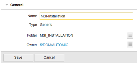
Main Business Entity Entry Page
For main entities (Application, Package, etc.) there are distinct entry pages that can be reached via the left navigation pane. Different views of these main entities can be selected in the sub navigation.
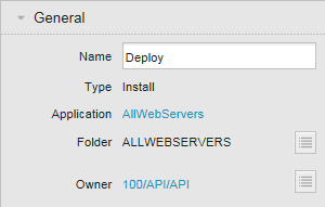
Main Business Entity Detail Page
Most business entities have also detail pages where you can access more specific functionality. The Details page of a main business entity contains both the sub navigation of the main business entity entry page and an entity-specific navigation for the current object.
Link Buttons
Link buttons (buttons which are shown as hyperlinks) are used when several buttons must be aligned vertically or the number of buttons is not fixed. The way link buttons are displayed depends on the user configuration.
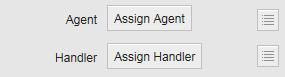
Normal Buttons
Normal buttons are used whenever actions are aligned horizontally and the number of required buttons does not depend on customer configuration.
If the action associated with a normal button is not available (for example, because of user permissions), the button is disabled but remains visible.
Context-Sensitive Buttons
Some buttons are only visible when a user actually needs them.
Example: the save and cancel buttons for properties are only visible when you edit a property within the panel.
Single Object Reference
For various use cases, you must reference a single entity from another entity. The standard pattern is as follows:
- If nothing is selected yet, a button is displayed with a select icon next to it.
- Click the button or the icon to open a popup with a table from which entities can be selected. Click the row that contains the entity you want to reference and click Select. To cancel the selection (and keep the current value), click the minus icon in the upper right corner.
- References are displayed as hyperlinks wherever possible. Click the link to navigate to the referenced entity.
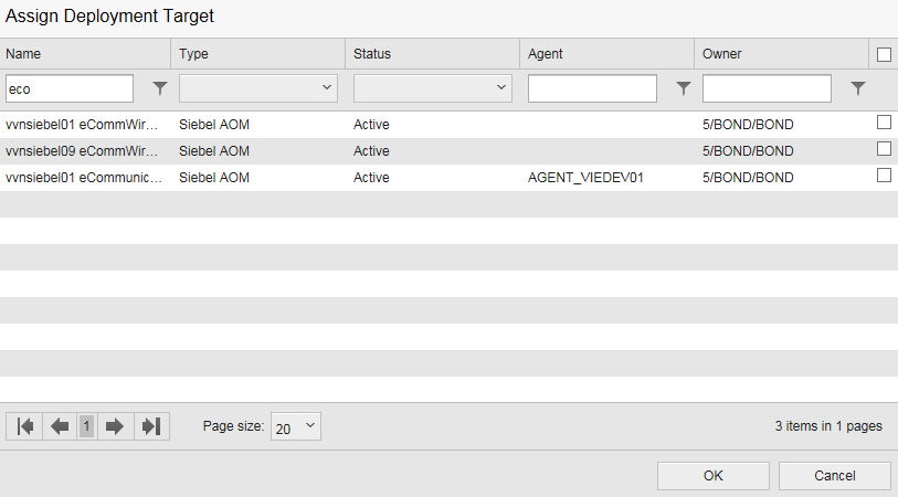
Multi Object Reference
You can reference multiple entities from another entity. The standard pattern is as follows:
- The currently referenced entities are displayed in a list. Next to each item there is a minus icon to remove the reference.
- Click the Add button to open a popup with a table from which you can select entities. The rightmost column is a checkbox column. All currently referenced items are checked.
- Select the checkboxes you need and click OK to save your changes. To cancel the selection (and keep the current selected items), click the Cancel button in the lower right corner.
If a screen supports multiple views, a drop-down (view selector) is shown in the upper left corner of the screen that displays the name of all configured views.
To switch to a different view, select another option in the view drop-down.
If you can define custom views, the Edit views option will be displayed in the drop-down. Click this option to open a subpage of the current entity where you can view and edit all defined views.
See also:Working with Custom Views

Environments also support a calendar view. You can switch between the calendar view and the default list view by clicking on the respective icon displayed in the section head.
Switching between list and calendar views retains information about your currently selected custom view and your current filters; the same items are displayed in the views.

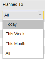
In the list view you can filter down the values in the filter bar under the list header. For the date and time filter you can select the following time frames:
- Today: Shows all records whose date / time values match with the current day.
- This Week: Shows all records whose date / time values match with the current week.
- This Month: Shows all records whose date / time values match with the current month.
- All (default): Shows all records.