Pie Chart Widget
This widget plots the attribute values or counts by percentage.
The Pie Chart widget converts the original attribute values or counts to proportional data, which is displayed as slices of a chart.
- Appearance
- Title: set the title of the widget (displayed in the upper part of the widget) .
If no title is defined, the default title Pie Chart is used.
- Title: set the title of the widget (displayed in the upper part of the widget) .
- Configuration:
- Grouped by: select how you want to group the data (by object name, client, status code, and so on).
- Define the maximum number of displayed top categories by selecting the desired number in the picker.
- Only show top N categories: To improve chart legibility in large data sets, use this option to only show TopN results.
- Show Others: If you have selected the Only show top N categories option and want to display the other categories, check this box. This may take some time if you have a large data set.
- Show. You can select the following values:
- Count:Total number of values by sub-category.
- The Number option is selected automatically.
In the Jobs drop-down list you can filter the status of the data to be displayed: ended or started.
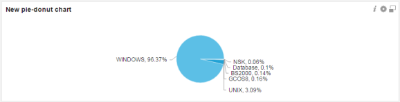
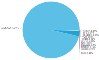
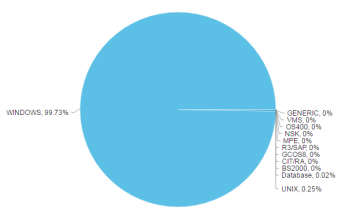
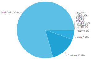
Example: the Agent Type category contains the following sub-categories: Windows, bs2000, and so on. If you select the count value, the total number of existing sub-categories by percentage is displayed:
- Sum: Total sum of a certain value of a sub-category.
- Select how you want to show the sum value: by runtime (real runtime) or by ERT (estimated runtime).
- In the Jobs drop-down list you can filter the status of the data to be displayed: ended or started.
Example: The started agents sum the following run time:
- Average: average value of an attribute that is listed by sub-category.
- Select how you want to show the average value: by runtime (real runtime) or by ERT (estimated runtime).
- In the Jobs drop-down list you can filter the status of the data to be displayed: ended or started.
Example: Average run time of all started agents:
- Count:Total number of values by sub-category.
Note: Hover over the slices to see the exact number of reported elements.
Note: You can remove one or more slices by clicking them, selecting the exclude selected elements checkbox and clicking Apply.
- Description: optionally, you can specify a description to identify the data that is displayed.
Setting Widget Specific Timeframe
You can set a specific local timeframe directly in a widget. When this feature is activated, all data contained in the widget is specific to your set timeframe. All other widgets in your dashboard are unaffected by individual widget changes.
