Property Groups and Properties
Control Types
As an administrator you can choose one of the following types:
-
Single Line Text
Short single line text with a maximum of 2000 characters.
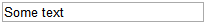
Type: SingleLineText
Operators
- Equals
- Not Equals
- Like
- Not Like
Note: When using the Like, or Not Like operator, * is used as wildcard.
-
Short Text
Short multiline text with a maximum of 2000 characters. You can click the icon to open a pop-up with a larger text box.
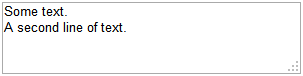
Type: ShortText
Operators
- Equals
- Not Equals
- Like
- Not Like
Notes:
- When defining filters in custom views, a single line text box is displayed to users for entering the filter value.
- When using the Like or Not Like operator, * is used as wildcard.
-
Long Text
Long multiline text with an unlimited number of characters. You can click the icon to open a pop-up with a larger text box. (Stored in a CLOB field in the database)
Type: LongText
Operators
- Equals
- Not Equals
- Like
- Not Like
Note: When defining filters in custom views, a single line text box is displayed to users for entering the filter value.
When using the Like or Not Like operator, * is used as wildcard.
-
Single Choice
Users can select one of the predefined options. The options are displayed in alphabetical order.
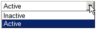
Type: SingleChoice
Operators
- Equals
- Not Equals
Note: When defining filters in custom views, a drop-down list is displayed to users for entering the filter value. The drop-down list contains all possible values of type versions combined for the property name.
-
Multi Choice
Users can select more than one option by clicking the shift key. The options are displayed in alphabetical order.
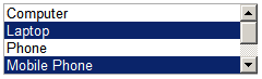
Type: MultiChoice
Operators
- Contains
- Not Contains
Note: When defining filters in custom views, a drop-down box is displayed to users for entering the filter value. The drop-down box contains all possible values of type versions combined for the property name.
-
Integer
Only integer values are allowed.
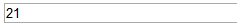
Type: Integer
Operators
- =
- >
- >=
- <
- <=
Note: When defining filters in custom views users may only enter integers in the value text box.
-
Float
Only float values are allowed.
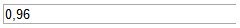
Type: Float
Operators
- =
- >
- >=
- <
- <=
Note: When defining filters in custom views users may only enter floats in the value text box
-
Date
Users can select a date via a date picker.
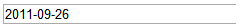
Type: Date
Operators
- =
- >
- >=
- <
- <=
Note: When defining filters in custom views a date picker is displayed.
-
Date and Time
Users can select a date and time via a date/time picker.
Type: DateTime
Operators
- =
- >
- >=
- <
- <=
Note: When defining filters in custom views a date/time picker is displayed.
-
Checkbox
Users can check or clear the control.
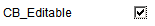
Type: Checkbox
Operators
- Equals
- Not Equals
Note: When defining filters in custom views a checkbox is displayed.
-
E-Mail
The title or email address is shown as a link in the sidebar. If you click the link the mail client opens. To insert a title and email address click the edit icon after the link.
Click the remove icon (x) to clear the field.
Type: Email
Operators
- Equals
- Not Equals
- Like
- Not Like
Note: When defining filters in custom views, a single line text box is displayed to users for entering the filter value.
When using the Like or Not Like operator, * is used as wildcard.
The search is always only related to the value of the title and not to the email address itself.
Grids always display the title. If you click the email address, the email program is launched depending on your system settings.
-
Link
The title or url is shown as link in the sidebar. If you click the link a new browser window opens the defined url. To define a title and url click the edit icon after the link.
Click the remove icon (x) to clear the field.
Type: Link
Operators
- Equals
- Not Equals
- Like
- Not Like
Note: When defining filters in custom views, a single line text box is displayed to users for entering the filter value.
When using the Like or Not Like operator, * is used as wildcard.
The search is always only related to the value of the title and not to the address itself.
Grids always display the title. If you click it, the url opens in a new window.
-
File
The title or file is shown as a link in the sidebar. If you click the link you can choose between downloading or opening the file (standard browser action).
Click the edit icon after the link to open a pop-up for file selection and editing the title. Click Select to select a file to upload.
Click Upload to upload the file. A progress indicator shows the upload progress.
Click the remove icon (x) after the link to delete the attached file.
The file is stored in the database.
Type: File
Operators
- Equals
- Not Equals
- Like
- Not Like
Notes:
- This custom property type can be used to attach small files (e.g doc, txt) to entities of the deployment model. The files will only be added to the database, never deployed.
- To deploy artifacts, you can use the artifact model. For more information, see: Working with Artifacts
- The attached files can only be accessed via CDA's user interface.
- When defining filters in custom views, a single line text box is displayed to users for entering the filter value. When using the Like or Not Like operator, * is used as wildcard.
- The search is always only related to the value of the title and not to the file itself.
-
Identity
Useful when importing data from external systems. You can retain information about the origin of your entities using this type to save the external IDs.
The value of the property has to be unique across all entities with the same main type.
Type: Identity
Operators
- Equals
- Not Equals
- Like
- Not Like
Note: When using the Like or Not Like operator, * is used as wildcard.
-
Protected
Can be used for passwords. Values are encrypted before being stored in the database and cannot be exported, queried for, or used in custom views. Its value never shows up in cleartext in any log or history record. The password is only unencrypted when referenced from a dynamic property during a deployment. It can be up to 2000 characters long.

Type: Protected
-
Reference
Allows you to reference other entities of the following main types:
- Package
- Environment
- Target
- Application
- User / Usergroup (= Member, displayed as
User / Group) - Login
- Workflow
Type: Reference
Operators
- Equals
- Not Equals
- Like
- Not Like
Note: When defining filters in custom views, a single line text box is displayed to users for entering the filter value.
When using the Like or Not Like operator, * is used as wildcard.
The search is only related to the name of the entity.
Grids always display the name. If you click the name, the entity is opened.
Property Definitions and Property Groups are created and linked to types via the commands described in Admin Command-Line Interface for CDA Serverusing the Property (Group) Definition Schema. The following restrictions apply when a set of property groups and properties is created out of the XML property definition file (in addition to schema validation):
- Blanks at the beginning or end of property names or values are always trimmed
- A list is defined as a set of comma-separated strings. Blanks are trimmed.
Panel Group Definition
The following XML snippet shows the panel group definition:
<xs:element name="Group">
	<xs:complexType>
		<xs:sequence>
		<!-- Property Definition-->
		</xs:sequence>
		<xs:attribute name="name" type="bondstringtype"/>
		<xs:attribute name="displayName" type="bondstringtype" use="optional"/>
	</xs:complexType>
</xs:element>
Modes
-
name
The name of the property group
-
displayName
The display name of the property group which is used for labeling the property group in the user interface. It does not have to be unique. If no display name is given, the name is used as the display name on import.
Panel Properties Definition
The following XML snippet shows the panel properties definition:
<xs:element name="Group">
	<xs:complexType>
		<xs:sequence>
			<xs:element name="Property" maxOccurs="unbounded">
				<xs:complexType>
				    <xs:sequence>
					<xs:element name="Defaultvalue" type="xs:string" minOccurs="0"/>
				        <xs:element name="List" type="bondlist" minOccurs="0">
			                <xs:element name="Description" type="xs:string" minOccurs="0" maxOccurs="1"/>
			            </xs:sequence>
					<xs:attribute name="name" type="bondstringtype" use="required"/>
					<xs:attribute name="displayName" type="bondstringtype" use="optional"/>
					<xs:attribute name="type" type="bondproptype" use="required"/>
					<xs:attribute name="mode" type="bondpropertymode" use="required"/>
				</xs:complexType>
			</xs:element>
		</xs:sequence>
		<!-- Panel Group Definition -->
	</xs:complexType>
</xs:element>
Attributes
-
name
The name of the property. It must be unique within the entity definition.
-
displayName
The display name of the property which is used for labeling the property in the user interface. It does not have to be unique. If no display name is given, the name is used as the display name on import.
-
type
The type of the property.
-
mode
The edit mode of the property. (See table below for possible values)
Modes
-
editable
The group or property should be editable.
-
hidden
The group or property should be invisible (but can still be edited via API calls)
-
readonly
The group or property should be visible but read only.
-
mandatory
The property (or all properties in the group) are mandatory.
Element
-
Defaultvalue
The default value of the property. If it cannot be converted to the target property type, an exception is thrown. Dates have to be entered in the format
YYYY-MM-DD hh:mm:ss -
List
A comma-separated list of list values for properties of that type. List items are trimmed (not possible to have blanks in the beginning or end of list items)
-
Description
Description of the property (displayed as a tooltip on the Web UI)