Bar Chart Widget
The Bar Chart widget represents sets of categorical data as rectangular bars.

Widget description
The Bar Chart allows you to categorize one-dimensional data by attribute and then display the values you want as bars or columns.
- Appearance
- Title: title of the widget (displayed in the upper part of the widget).
If no title is defined, the default Bar chart title will be displayed.
- Display as: chart orientation.
The vertical orientation allows for a very good visualization of ordered/rank data. For example: show top 10 executions by runtime/number of executions. On the other hand, the horizontal orientation is especially useful to display load distributions over time.
- Title: title of the widget (displayed in the upper part of the widget).
- X-Axis: here you select the values to be displayed on the horizontal axis. You can select the following values:
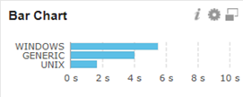
- Count: Displays the total number of records by sub-category:
- The Number option in the Show dropdown list is selected automatically.
In the Jobs dropdown list you can filter the status of the data to be displayed: ended or started.
Example: The Agent Type category contains the following sub-categories: Windows, Unix and Generic. If you select the count value and started status from the Show dropdown list, the total number of started agents will be displayed:

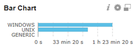
- Sum: Total sum of a certain value displayed by sub-category.
- Select how you want to show the sum value: by runtime (real runtime) or by ERT (estimated runtime).
In the Jobs dropdown list you can filter the status of the data to be displayed: ended or started.
Example: The 244 Windows Agents and 223 Unix Agents sum the following run time:
- Average: average of a certain value displayed by sub-category.
- Select how you want to show the average value: by runtime (real runtime) or by ERT (estimated runtime).
In the Jobs dropdown list you can filter the status of the data to be displayed: ended or started.
Example: Average runtime of all Windows, Generic and Linux agents:
- Count: Displays the total number of records by sub-category:
-
Y-Axis: Here you select the values to be displayed on the vertical axis. Data can be grouped by Agent type, Agent name, hour of day, object name, etc...
You can set a maximum number of displayed sub-categories by selecting the desired number in the categories picker.
Example: if you set the grouping limit to 2, only the biggest two sub-categories will be displayed in the chart:

Hover over the bars to see the exact number of reported elements.
You can remove one or more bars by clicking them, selecting the exclude selected elements checkbox and clicking Apply.
-
Description: Optionally, you can specify a description to better identify the data displayed.