Creating dynamic charts using SQLi VARA Objects
A VARA to Chart widget is an Analytics dashboard widget. The widget lets you create charts on analyzed data in a VARA object. VARA to Chart widgets work with static and dynamic VARA Objects. Design a one-off dashboard or a dynamic dashboard that can be routinely referenced.
The VARA to Chart use case presented here is based on the SQLi Variable (VARA) object. The use case demonstrates user logins, unique user logins, and session times over a 24-hour period on a specific client. Although this example is based on a SQLi VARA object, it can be applied to other Dynamic VARA objects.
See: VARA Objects
This page includes the following:
What Will You Learn?
- How to create charts using dynamic VARA objects
- How to use a Common Table Expression (CTE) in a SQL statement, to ensure that data points are displayed
Prerequisites
- Access and admin permissions to an AE database
- Good knowledge of how to create VARA objects in AE
- Good understanding of SQL and basic SQL statements
- A new or an existing dashboard to add VARA to Chart widgets
Note: If you want to share your dashboard, the end user will need to login to view the VARA objects, even if you have selected Allow Public Access to this Dashboard.
Use Case Objective
To help the local AE admin team understand user usage, they have asked us to create three charts.
- Chart One: display all user logins and a unique user login on a client over a 24-hour period
- Chart Two: display a chart showing top users per login
- Chart Three: display a chart with the average session time for the top users
VARA Objects Used
This example uses the following SQLi VARA objects that are created and SQL queries using a CTE:
- VARA.USER_LOGINS_LAST_FULL_24H.INCL_UNIQUE
Gets data based on user logins including unique logins on a client over a 24-hour period - VARA.USER_STATS.CONFIG
Used to set hours a unique client - VARA.USERS_TOP_USERS_PER_LOGINS
Lists the top users per number of logins - VARA.USERS_TOP_USERS_PER_SESSION_TIME
Lists the top users per session time
Chart One: Display all User Logins and Unique User Login on a Client over a 24-Hour Period
- Create the SQLi VARA object: VARA.USER_STATS.CONFIG. This object is used to configure the hours and unique client.
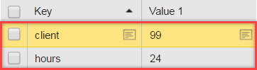
The object is also used as Bind Parametersin all our listed VARAs.
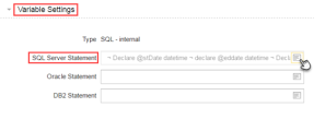
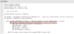
- Create another SQLi VARA object: VARA.USER_LOGINS_LAST_FULL_24H.INCL_UNIQUE. This object is used to retrieve data on all client logins and unique logins during a 24-hour period. To retrieve data from the AE database, we use the VARAs embedded cell editor to add some SQL Server statements.
- To ensure that the displayed charts represent all hours in a given time period, create a Common Table Expression (CTE). Charts also display every full hour in a 24-hour period, even if a unique login takes place or not. As a consequence, our data is displayed as a complete time series chart. The following basic entities are considered in the CTE: current date, end date, and logins and unique logins for "N" full hours.
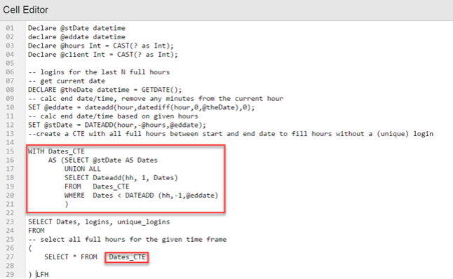
Data is used for unique logins on the specified client, and to all the full hours between the start and end period.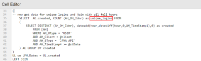
Having configured 24-hours in the VARA.USER_STATS.CONFIG VARA and used a CTE, 24-hours should be displayed in a chart.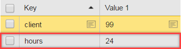
Repeat the same steps with all client logins and join to all the full hours.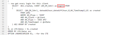
Example:
Chart displaying hours without logins, however all 24-hours are represented: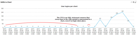
Note: In this use case, CTE is used to define all the hours in a given chart period. CTE can also be adapted to express all given days, months, or years in a chart period.


Chart Two: Display a Chart Showing Top Users per Login
- As shown in Chart One; Chart Two is based on the same client and hours, therefore we continue to use the SQLi VARA object: VARA.USER_STATS.CONFIG.
- As shown in Chart One; Chart Two is based on the same client and hours, therefore we continue to use the SQLi VARA object: VARA.USER_STATS.CONFIG.
- Use the VARA.USERS_TOP_USERS_PER_LOGINS object for this chart. The object is used to retrieve a list of the top users per number of logins.
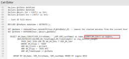
- To retrieve data from the AE database, we use the VARAs embedded cell editor to add an SQL Server statement. Using some basic SQL, we select user first and last name and then count their logins in the last 24-hours:
Data preview: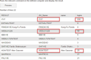


Chart Three: List the Top Users per Session Time
- Chart three is based on the same client and hours, therefore we continue to use the SQLi VARA object: VARA.USER_STATS.CONFIG.
- Use the VARA.USERS_TOP_USERS_PER_SESSION_TIME VARA object for this chart. The object is used to retrieve a list of the top users per session time. Again, to retrieve data from the AE database, we use the VARAs embedded cell editor to add some SQL Server statement. Select the user first and last names. Count their logins in the last 24-hours, and then use the SQL AVG function that is used to retrieve the average session for each user.
Data preview: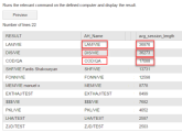


Display a VARA to Chart in a Dashboard
The home page is where you create dashboards. For more information, see Creating Dashboards and Adding Widgets.
- Click the green Add Widget button from the dashboard toolbar.
- Select the Analyticstab, then select a VARA to chart widget.
- A new VARA to Chart widget is created on the dashboard. Click Configure Widget to start configuration.
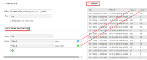
- In the data source section using the VARA drop-down list, we select the appropriate VARA object. In our use case for each chart we select:
- VARA.USER_LOGINS_LAST_FULL_24H.INCL_UNIQUE
- VARA.USERS_TOP_USERS_PER_LOGINS
- VARA.USERS_TOP_USERS_PER_SESSION_TIME
Multi-series Chart (Required for Chart One)
We are using multiple values. To include all client logins, and unique logins, select the Multi series chart option
- Click the Multi-series option button. The chart Type automatically changes to Column and the multi-series data-mapping pane is displayed.
- We now add the additional values (using the green plus button) and customize each value header.

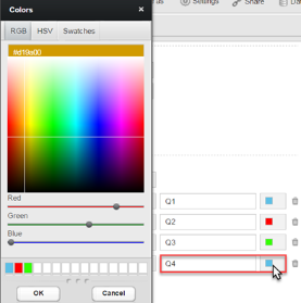
Add Color
After we have mapped our values, we can then associate each individual value to a color using the color button.
Configure the Chart
Click the Chart Configuration tab. Not all options are covered in this example. For more information, see Vara to Chart Widget.
Here is what chart one looks like after configuration:


Here is what chart two looks like after configuration:

Here is what chart three looks like after configuration:

Add a Chart Description (Optional)
The chart Description tab lets you add further information regarding your chart.
Useful Links
This use case contains references to several functions that you can discover.