Job Dependencies Graph Report
The Job Dependencies Graph report illustrates the upward and downward dependencies of a specific job in a web diagram. This is another way to visualize dependencies in a jobstream, which you do most often in the Gantt charts of jobstream executions. Like the Gantt chart view of a jobstream execution on the Monitoring tab, the Job Dependencies Graph is continuously updated in real time to reflect the current state of the executions. The job nodes on the graph are color-coded to indicate which jobs are currently running.
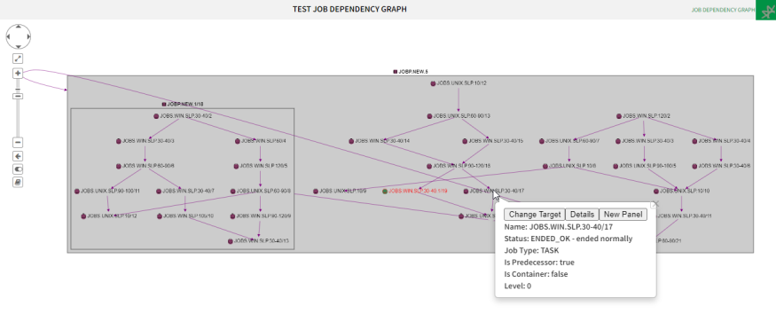
By clicking a job on the graph, you open a pop-up pane with information about the configuration of the job, its current status, the last run and so forth. You can also get
The complexity of the graph depends on how you configure the panel. Two configuration options are relevant in this respect:
-
All children inherit level from parent
If you select this option, the graphic displays every single upstream dependency. If you select a job which is embedded in several layers of containers, all dependency arrows pointing to the top container are displayed. This can make the graphic unreadable.
-
Include Non-impacting Box Children
If the selected job has children which are containers with no impact on the job, you can exclude them to make the graphic more readable.
-
Show Levels
You can select the number of parentage layers you need.
Working with the Graphic
The graphic provides multiple capabilities. If you click any other job in the graphic, a pop up is displayed, where you can do the following:
-
Select a different target job
The job that has been selected to create the report is displayed in red. Click a different job and select Change Target to display the graph of that job in a new panel that is inserted on the same page. This is the same as editing the filter criteria using the new job as target.
-
Display job details
Click a job in the graph. The pop up displays basic information on the job. Select Details to open a new pop up with more information about the job (properties, predecessors, machine, status, and so forth). Some of this data are formatted in bold and blue indicating that they are links. Click them to open a pop up that contains detailed information about that particular item. The pop up also contains links with further information on that particular item.
-
Duplicate the chart in a new panel
Click the selected job and select New Panel to open the same graph in a new panel that you can then modify.
-
Modify the view with the controls on the graphic toolbar:
-
Virtual joystick to move the report display. You can also move it by clicking and dragging it.
-
Zoom in and out.
-
State switch that lets you hide the states (only the job definition is visible), display the Current Job State (statuses from the last run) or Current Cycle (statuses in the present time).
-
Working with the Report
Click the icon on the top right corner of the panel to open a menu with the configuration options:
-
Edit
Opens the configuration dialog where you can edit the name, published status, and filter criteria used for the report. For each data source you can add as many criteria as you need to narrow down the scope of the report. Combinations of these criteria are evaluated as logical OR relationships.
-
Copy
Creates a copy of the panel that you can then re-configure and adapt to your needs.
-
Move
Moves the panel to a different page (dashboard).
-
Delete
Deletes the panel.
-
Shorter/Taller
Resizes the panel vertically.
-
Download
Downloads the report in the format you choose: PDF, XLSX, XLS, RTF, CSV, ODT, ODS, DOCX, or PPTX.
-
Get Link
Creates a link to the report that you can share with other users.
See also: