Working with Widgets
Widgets are based on templates (widget types) that are predefined for a certain type of data and presentation but can be customized.
This topic provides information on the following:
Working with the Widget Toolbar
Click on a widget header to activate it. Activated widgets are highlighted and the widget toolbar on their upper right corner is displayed. The toolbar is also visible if you just hover your mouse over the widget.
| Toolbar icon | Function |
|---|---|

|
Opens a tool-tip with details on the contents of the widget and a short description of actions you can take with it. |

|
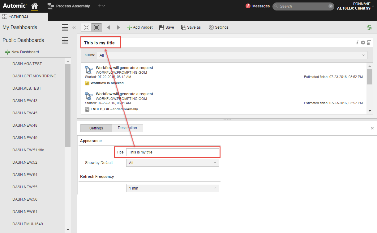
Maximizes the widget and opens a pane at the bottom of the window displaying tabs where you can change the settings of the widget. The available tabs and options depend on the type of widget. Each widget shows either information content or aggregated and compiled data, typically presented as a chart or as a list. The settings that can be applied to a widget depend entirely on their type, however, the following are common to all (or most of them):
|

|
Maximizes (full screen) or minimizes the widget. |

|
Closes the widget. |
 icon on the widget toolbar. For example:
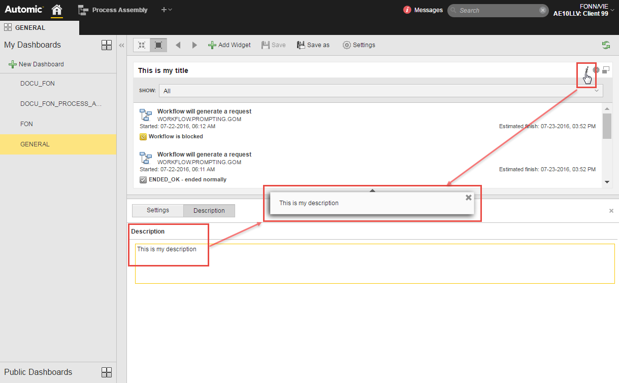
 on the dashboard toolbar.
For details on specific widget setting see:
However, widgets do not simply display data; they also provide links.
For example, if you click on any task in the Activities widget, you will switch to its Executions view in the Process Monitoring perspective. Or if you are using the Process Monitoring widget, clicking on task opens it in the perspective in the Modify view.
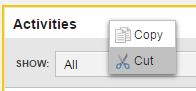
Right-click on the widget header to open a context menu displaying the Cut and Copy options. They allow you to move it to another place in the dashboard or to a different dashboard altogether.
Within a dashboard, you can also use the drag and drop function to move it.
Use the icons widget toolbar to maximize/minimize it.
If there is an empty space by the widget you want to resize, you can activate it to display a yellow frame. Drag it to expand the widget; it automatically snaps to the next border in the dashboard's grid
The content a widget presents depends on its type.
See also: